Mandelbrot or Mandel-not?
My first attempt at plotting fractals using Excel.

I love fractals. I first discovered them in my teens while reading James Gleick’s classic Chaos Theory. I was fascinated by the self-similarity which could be demonstrated at any scale, and also by the seemingly simple equations which produced the plots. I was also totally taken in by the idea of a fractal dimension which could be used to explain the properties of some naturally occuring structures and features in our world.
Several months before the pandemic hit, I came across a niche website called Excel Unusual which focused on doing animations using Excel. I was inspired by the blogger’s intrepid approach of making Excel do things it wasn’t really designed to do, and so I decided to see if I could plot fractals using Excel. What follows is a description of my attempts and the results of those efforts.
First Steps
I first started by writing some code to implement the escape time algorithm to find points which were members of the set. My first attempts produced plots which had the general shape of the set, but which weren’t very refined which I jokingly call the Mandel-not:
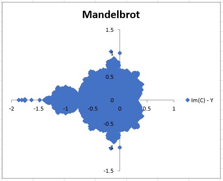 One of the initial mandelbrot plots
75 000 points were evaluated for the plot shown above, and approximately 15 000 were determined to be members of the set. The points were evaluated using the following constraints:
| Description | Value |
| X Range | 2.5 |
| Y Range | 3 |
| X Start | -2 |
| Y Start | -1.5 |
| Point Increment | 0.01 |
| Max Iterations | 1000 |
Observations
After some experimentation with the maximum number of iterations, I came to the conclusion that there was no advantage to going beyond 80 because there wasn’t a positive increase in the number of points found in the set. I actually noticed a decrease in the number of set members as I increased the maximum number of interations:
| Max Iterations | # of Points Tested | # of Points in Set |
| 80 | 60 000 | 15 568 |
| 150 | 60 000 | 15 300 |
| 300 | 60 000 | 15 161 |
| 1 000 | 60 000 | 15 087 |
Improvements
Apart from limiting the maximum number of iterations, I also found that modifying the start and end points for x and y as well as selecting a different type of graph resulted in a distinct improvement in the overall quality of the plots. Evaluating 60 000 points using the improved constraints yielded:
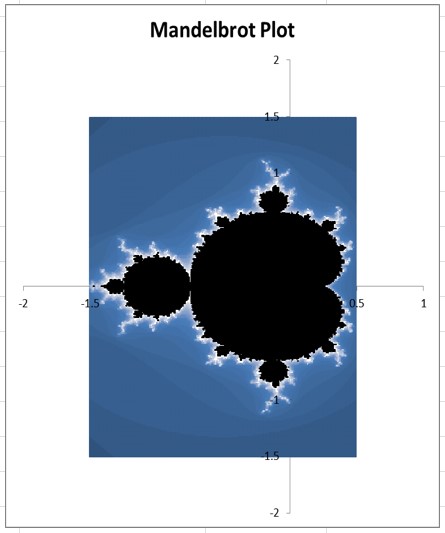 Plot resulting from updated constraints
The constraints used to evaluate the points:
| Description | Value |
| X Start | -1.5 |
| X End | 0.5 |
| Y Start | -1.5 |
| Y End | 1.5 |
| Point Increment | 0.01 |
| Max Iterations | 80 |
Conclusion
The plot is not as beautiful as images made using other software due to the limitations of Excel graphs. However, the main features of the set can be clearly seen. I experimented with different types of graphs, but the results obtained didn’t offer much in terms of improved image quality or colour aesthetics. It might be possible to produce more visually impressive plots by writing code to change the colours rather than relying on the preset colour palettes used by the graphs in Excel, but I really don’t think that the juice is worth the squeeze.
After proving that it was possible to plot a fractal like the MandelBrot using Excel, I turned my attention to trying to plot other fractals such as the MandelBar and Julia sets. I will share those results at some point in future posts.
   |